MOSHI MOSHI
MOSHI MOSHI
CDMX, Mexico, 2019
KAITEN SUSHI
Renovación 2019
SERVICES
ARCHITECTURE/INTERIOR
PRODUCT/INDUSTRIAL/FURNITURE
VISUAL IDENTITY
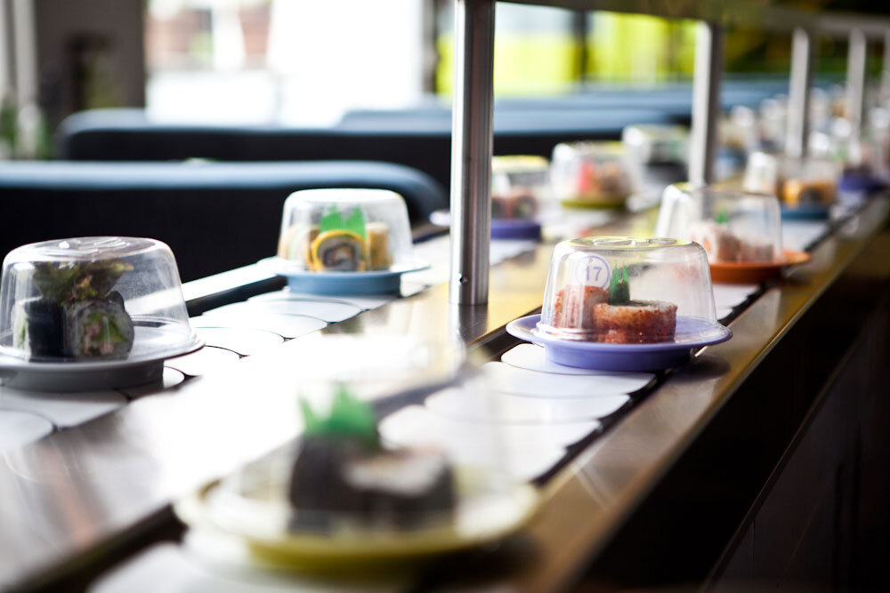
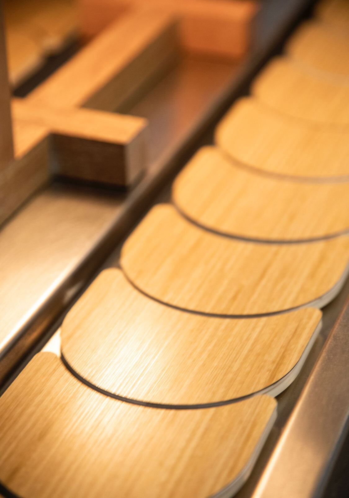
Revolutionizing the experience of Japanese food in Mexico, Moshi Moshi opened in 2003, presenting, for the first time, the innovative and disruptive kaiten concept, the iconic sushi conveyor belt.
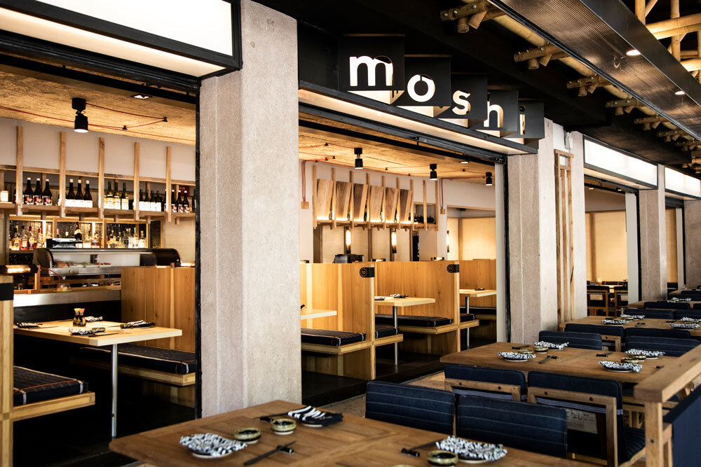
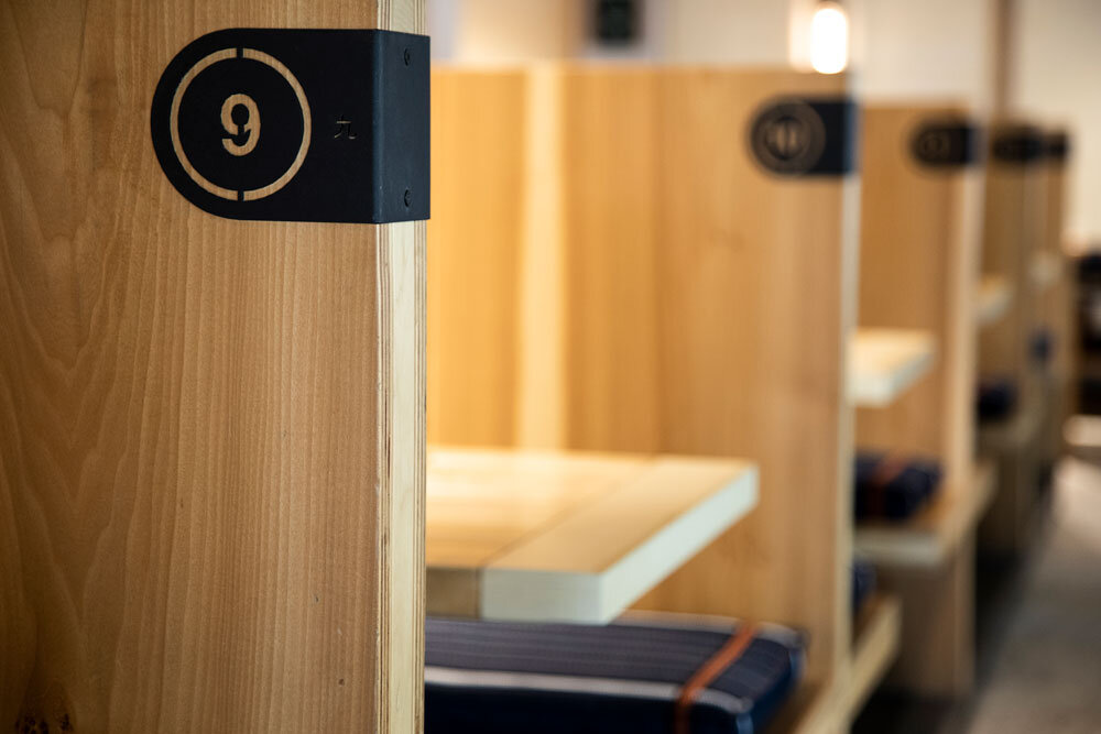
The original, fresh, and novel design included wooden booths and tables around the belt, in addition to comfortable seats, modern hanging lamps, paper ornaments, and colorful details inspired by manga-style graphics.
Adapting to the evolving preferences of Mexican consumers, and on the occasion of its 15th anniversary, Moshi Moshi traced its reinvention by genuinely evoking both the ancient and most modern essences of Japan. Authenticity, a return to one's roots, and the value of raw materials were the guiding principles in this new era.
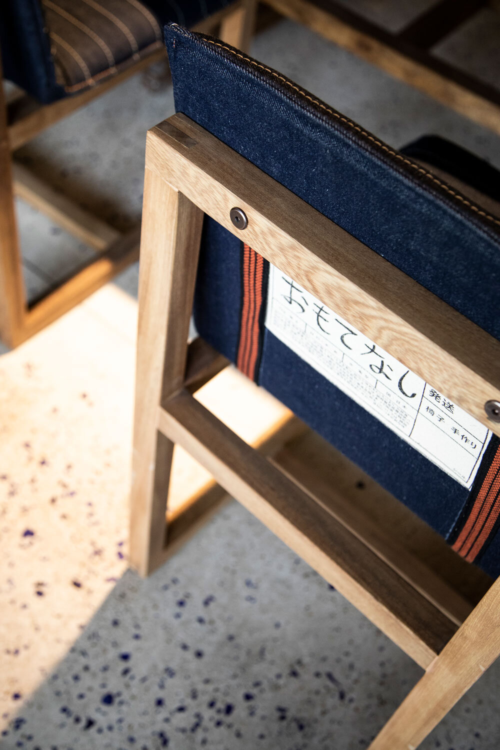
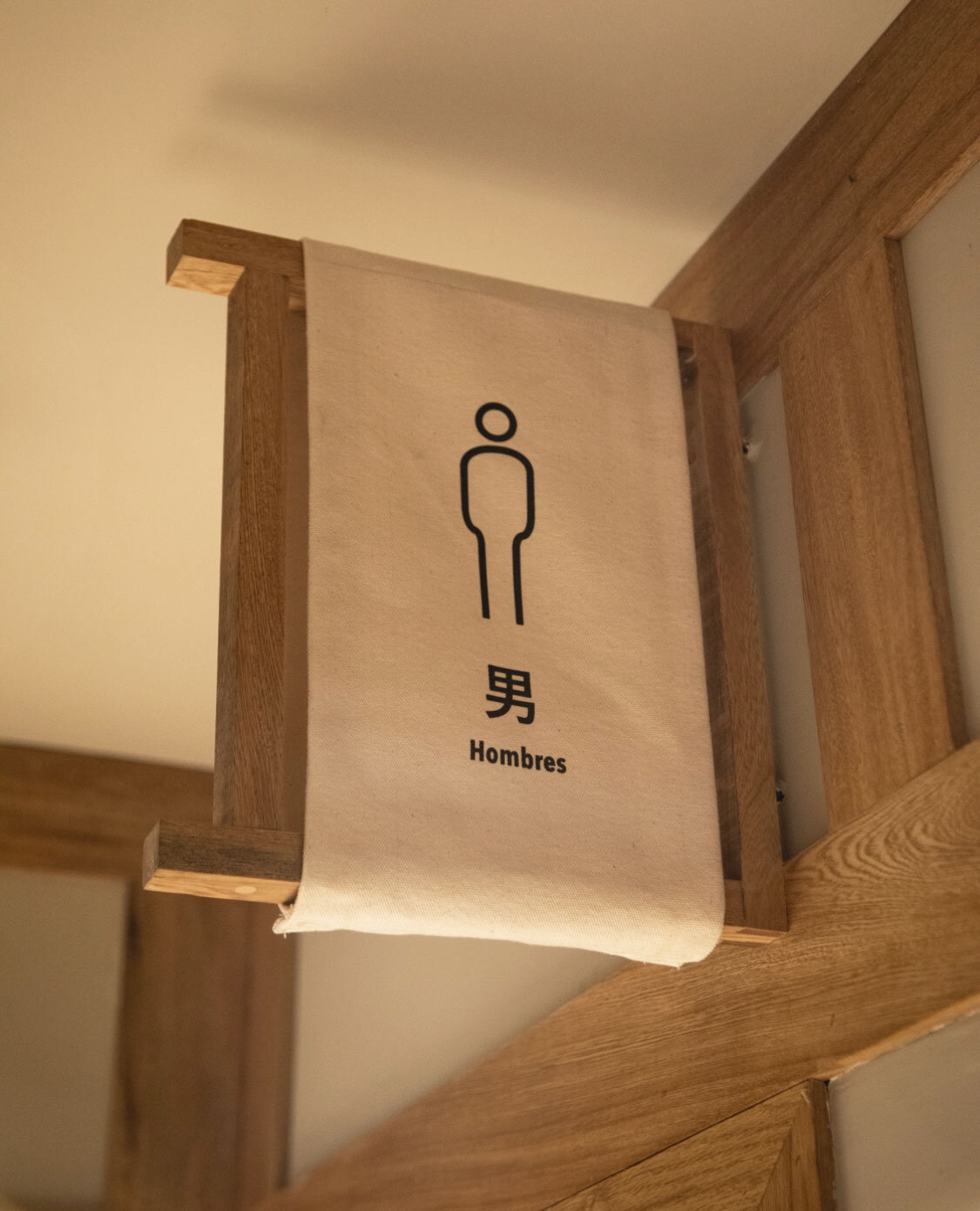
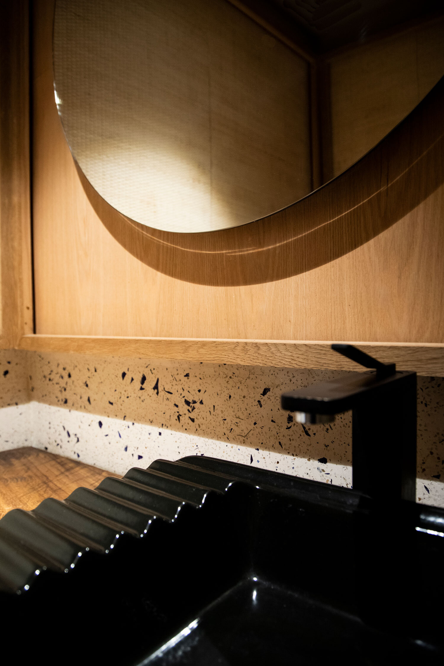
The new look and feel is reminiscent of the constant convergence of past, present, and future. The architectural details and the inspiration behind its interior decor merge avant-garde touches with artisanal calligraphy work and rustic finishes, using natural materials that include bamboo, stone, and textiles, which have been transformed to give the place a contemporary atmosphere in sync with the culinary concept. For evoking classic izakayas, a new color palette and different distinctive elements were introduced.
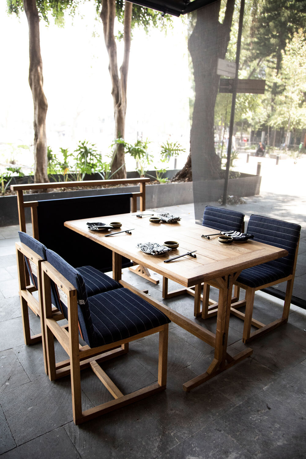
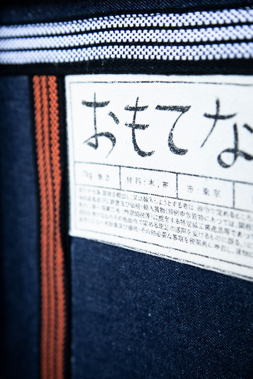
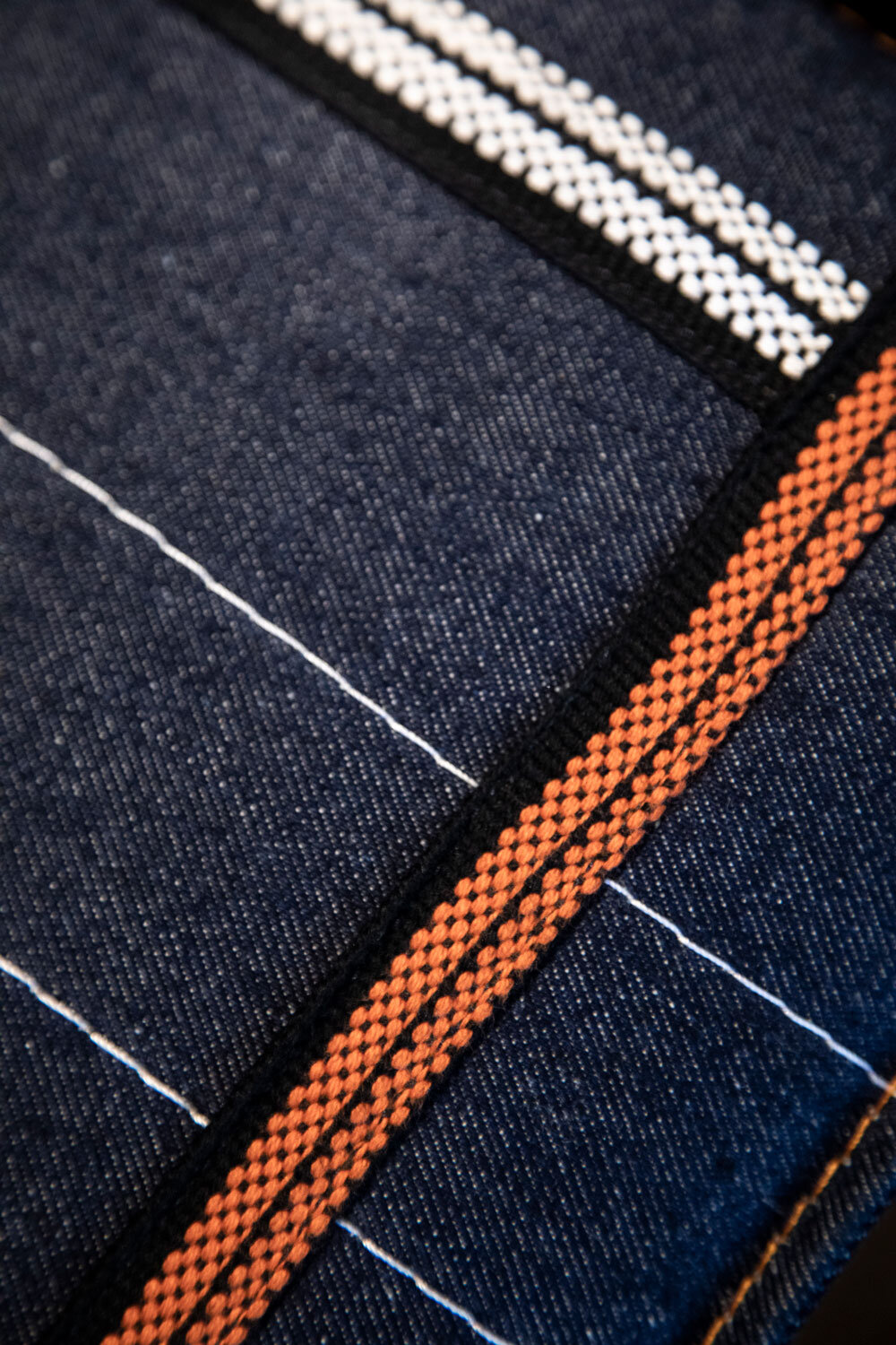
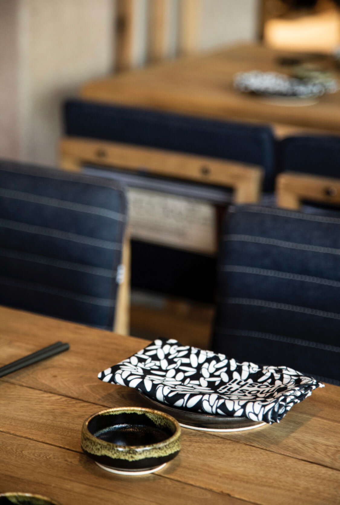
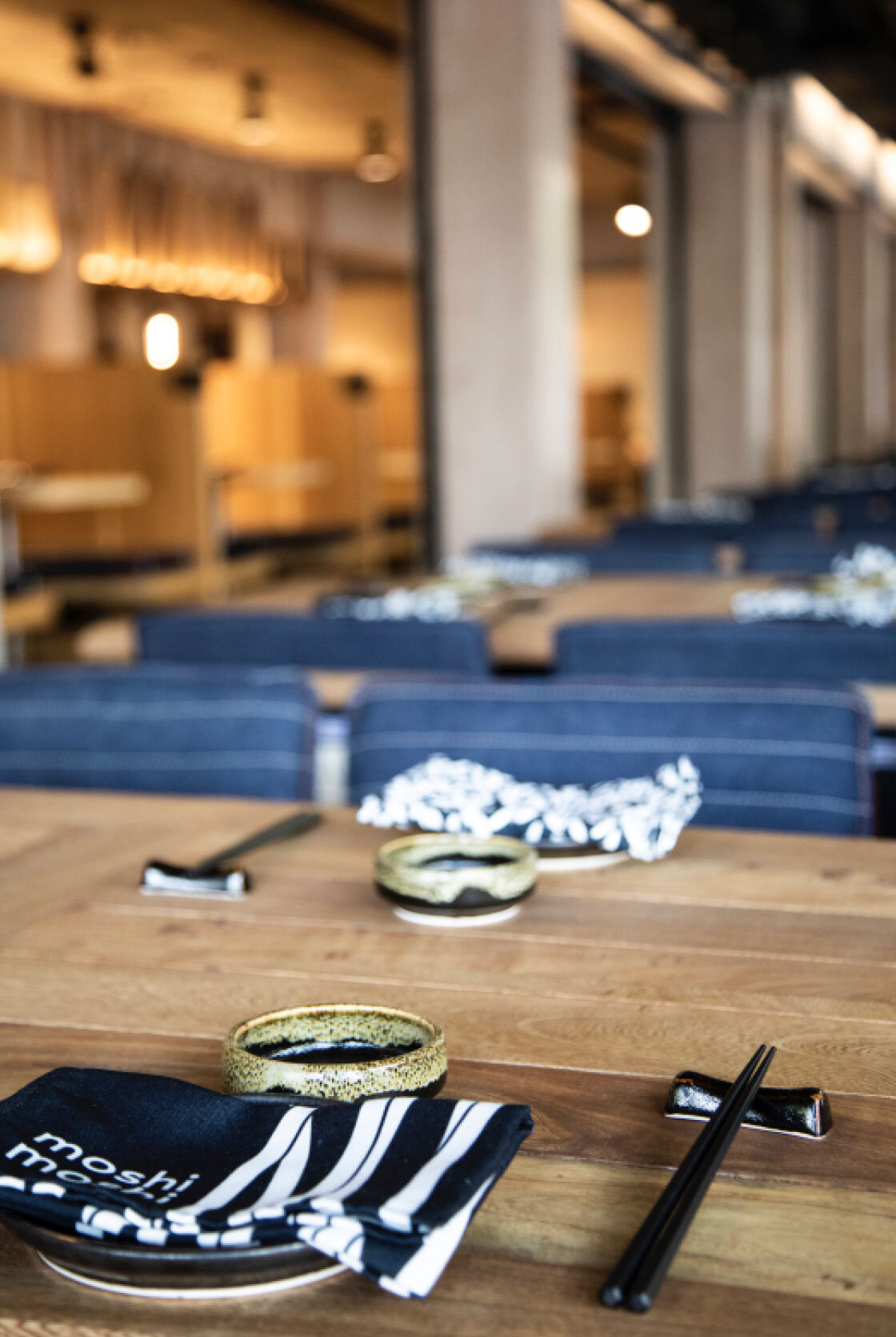
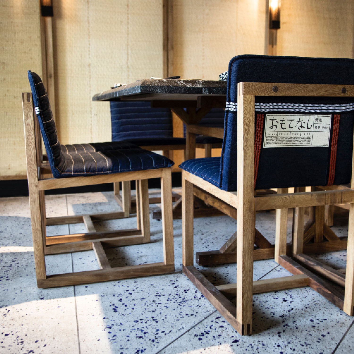
Renewed, more stylish furniture, using light-colored wood and textiles like denim, harmonizes with a refined interior design that includes terrazzo floors and woven walls, representing the texture of tatami. On the other hand, striking folding lamps recall traditional Japanese lanterns made of rice paper with bamboo rings.


